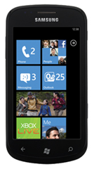
It took a bit of wheeling and dealing – I had three cell phone contracts for my wife and I – but I was able to lock down this little beast of a phone this weekend.
I had a WinMo 6.5 phone with another carrier, and two flip phones with Rogers here in Canada. I had to dump my other contract, which cost me $150, and then pay $99 to upgrade my flip phone to the snazzy little Windows Phone 7 number from Samsung.
Though I am a software developer, I am writing this review as a user and trying not to pay attention to the elements I would normally focus on as someone in the development camp.
First Impressions
I have to admit: I’ve long been been a WinMo user, so I had really low expectations going into this phone. When I picked it up and tried it at the booth in the mall I was looking for something not to like.
I got locked into my last smart phone contract before the iPhone had any decent corporate email and calendaring support (and those who follow know my history with Apple anyways) so my choices back then were quite limited.
But I was refreshingly surprised. The interface was speedy, swipey, flippy, crisp, and that really lured me in. I entered into Operation Crapdump: getting rid of my old WinMo 6.5 device and jumping into the new now.
 The Device Itself
This is a lightweight phone, easy to hold. I have big man-hands, and it is on the upper-end of wide when you’re holding it to talk, but it’s no wider than an iPhone. I’ve only had it for a couple of days, but it has not been awkward to hold, use or store in my pockets.
The battery judgement will have to come later, as I’ve only had the phone for a few days, but it’s lasted now almost 90 hours without much charging (I charged it when I got it, then had it plugged in a couple of hours while I was pooting around in Zune).
The screen is great – big, sharp, contrasty, good colors. My wife thinks her iPod Touch looks like a relic next to this. When we pulled up the same photos on Facebook and held the devices side-by-each, the difference was startling. Black is black, white is white and the colors POP off the screen. I absolutely love how good this phone looks.
The touch experience is different than iPhone/iPod. I haven’t used it enough to say I have a preference either way, but I don’t mind it. It’s less ‘pressy’ than iPhone and more ‘tappy’. You also get a little vibration from the device to confirm button presses taps.
The camera on the device takes reasonably good pics and I love having the video handy as well. My HTC Touch Diamond took “okay” pictures, but the video the device captured wasn’t worth the boot time of the video camera on the device. I already have a Grammy-winning prize video of my daughter off the Focus, and I’m about as un-biased as they come. ;o)
I’ve heard that on some other brands running WP7 that the camera and screen aren’t that great, but the Focus really shines well here for a 1st generation phone.
My only complaint is more related to my previous phone, which trained me that the manufacturer logo is at the bottom of the screen. Every time I pull the thing out of my pocket it’s upside down and I’m looking for the power button before I realize what I’m doing.
The Windows Phone 7 Platform
I have to say that I am really impressed with what I’ve seen, with a few caveats. The minimum specs and the way the framerate is locked at 60fps will make any phone on the OS nice and snappy. The very quick boot (though nearly irrelevant in my always-on world) is such a difference from the 1m30s + boot times I’m used to.
Back to the camera quickly…I think it was a really good choice to make some vendor-level requirements and have the device respond quickly to a held-in camera button. If you’re not familiar with this feature, basically, whatever state your device is in (locked, phone call, playing a game) if you press and hold the camera button for about 2 seconds the camera flips on. Again, less than 4 days in, but I’ve used this feature half a dozen times already.

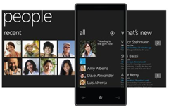
Pinning is great and can’t really be explained without some video. This is the feature that lets you put important people, apps or deep links onto the home screen.
The home screen itself I’m a little mixed on. At first it was great…there was enough there to be functional and show off push-enabled tiles and the likes, but as I pin more and more things, it’s getting a little long. You can leave apps off the home screen and just in the apps page (a right-to-left swipe of the home screen) but with only the two options I think there is definitely room for some organizational improvements. My hope in this regard is that they are able to maintain the truly awesome Metro interface.
Finally, the apps. They’re coming, but there’s not a lot there yet. I’ve picked up a few and will post on those later. The Marketplace is easy to navigate and uses the integrated search button on the phone, but I think it’ll also need some improvements when the volume of apps goes up.
The Ecosystem
I get it now. Xbox changed. Messenger changed. Zune changed. And now, they all look the same as Windows Phone 7. Though I hadn’t really used Zune too much prior to getting the Focus, I knew exactly what to do just by loading it up.
It is very natural to move between these devices and applications and I think that Microsoft has done a better job at this than any other vendor. Apple, for example, has their Apple TV, their iOS stuff and the Mac platform, and it doesn’t feel the same at all. iTunes feels nothing like the iPod touch or iPhone. This is where the unified UI really works for Microsoft…Zune looks like it could run on the WP7 phones. Apparently the other vendors have noticed, too, as Apple preps to overhaul Mac OS to look more like iOS.

Using Windows Live ID for me worked really well as I’m an Xboxer and I use Live Messenger and Hotmail. With Xbox live and Zune and the phone and everything synced to the cloud, I’m really liking the experience so far but have yet to push it to its edges.
Things I don’t Like
“Hello? Microsoft? Yeah, this is Canada calling. Please give us the Zune Music Marketplace. And Zune Pass. Please.” And I’m very serious about this.
That’s right, fellow Canucks, no music store. Lamers to the max extreme.
Again, one thing I’m kind of torn on is messaging all in one place. I would also like to see a unified inbox, though I do like the way I am able to differentiate between email accounts on the home screen.
Conclusion
This phone and platform is a different experience. It doesn’t behave like an Android or an iPhone. If you go into something expecting it to work like something else you know – as though the other one was better simply by definition of its creation – you will never be impressed with other items in the same commercial space. You will also be labeled a fan boy.
I am pleasantly surprised by this device. I am happy to be a (relatively) early-adopter but I am looking forward to the updates and some of the features down the road. My hope is that Microsoft rolls out features and updates early and often and continues to accept consumer feedback.
I suspect that any non-smartphone user would be excited about this phone, as well as any of the early iPhone users. My iPhone friends and non-smartphone users are all really impressed with the phone (especially the screen).
If it is time to upgrade, you may wish to wait until later in the year, but if you pick up the Focus right now I don’t think you’d be disappointed. If you use Hotmail, Live and have an Xbox, you’ll be geekin’ out.
No comments:
Post a Comment